Color can have unexpected effects on people. It can: change taste perception, speed up or slow down the heartbeat, and even influence the opinion about the reliability of a particular brand.
Obviously, different shades will induce a person’s emotional state and his shopping habits.
If you study this impact and use it correctly, you can significantly improve the performance of your ad. The effect can be very noticeable. For example, 85% of consumers say that color is the determining factor for them when choosing a particular product. 66% of people won’t make a purchase if the product is in a color they don’t like.
People choose one or another color depending on how they feel at a given time. Thus, it is possible to provoke a change in the mood of the audience.
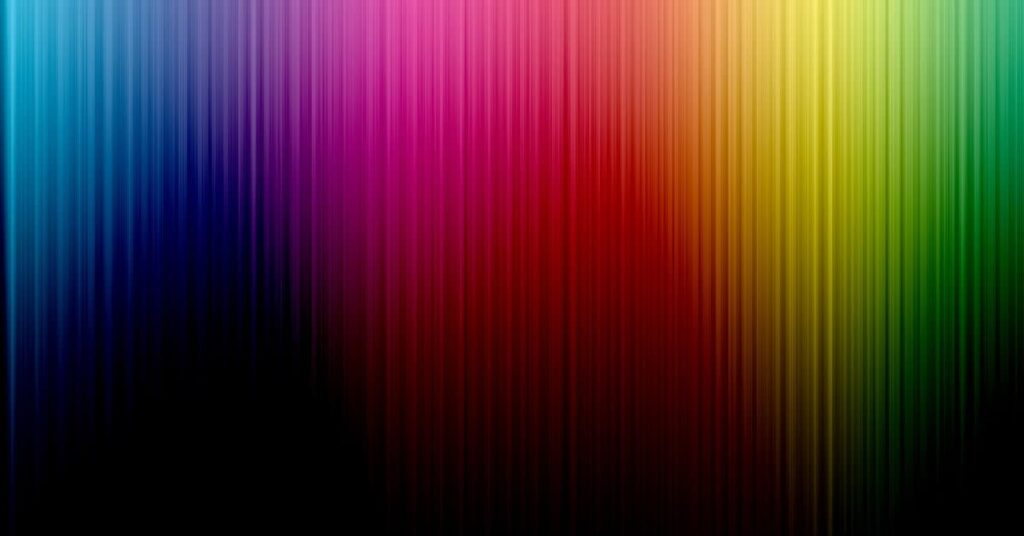
How to predict the reaction of people to different shades and get to the point? Let’s figure it out together. Consider six primary colors and their information message.
Blue
Blue color symbolizes calmness, stability, confidence. Therefore, such ads get more clicks and increase sales.
Light blue creates a feeling of freedom and security, while dark blue is associated with tradition, seriousness and intelligence.
Creatives with a predominance of this color are suitable for finance, medicine and insurance.
Meaning in advertising:
- has a calming effect;
- preferred for men;
- should not be used in the food industry.
Brands that use blue as their main color: Facebook, PayPal, Samsung, Nivea, Ford, Visa, American Express, Pepsi, Intel, Skype, Twitter.

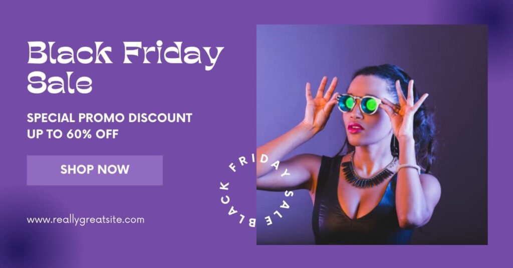
Violet
The color symbolizes wealth, prosperity and luxury. It is best to match purple visuals with offers that are targeted at women.
According to statistics: 77% of women love purple and another 11% are neutral to it; only 28% of men like purple, the rest of the color does not cause any emotions.
Purple color features:
- has a strong influence, so it should not be too much, the exception is a soft purple tint;
- it is the color of contradictions and rebellion;
- well received by children.
Brands that use purple as their main color: Milka, Viber, Yahoo.
Red
It symbolizes danger, warning, urgency and at the same time strength, love, passion. Color encourages spontaneous purchases, which is why buttons and calls to action are often highlighted in red. If you have already attracted the visitor’s attention with an impeccable design, they are interested in high-quality text, then a red button with a clear call to “Start”, “Search” or “Buy” will come in handy.
Also, it is often used to draw attention to discounts and promotions that are limited in time. This color can be seen in advertisements for underwear, cars, food, alcohol.
Features of using red in creatives:
- stimulates appetite, so it is often used in fast foods;
- causes an effect of urgency;
- associated with sales;
- speeds up the pulse.
Brands that use red as their main color: Youtube, Netflix, Coca-Cola, Opera, MyTarget.

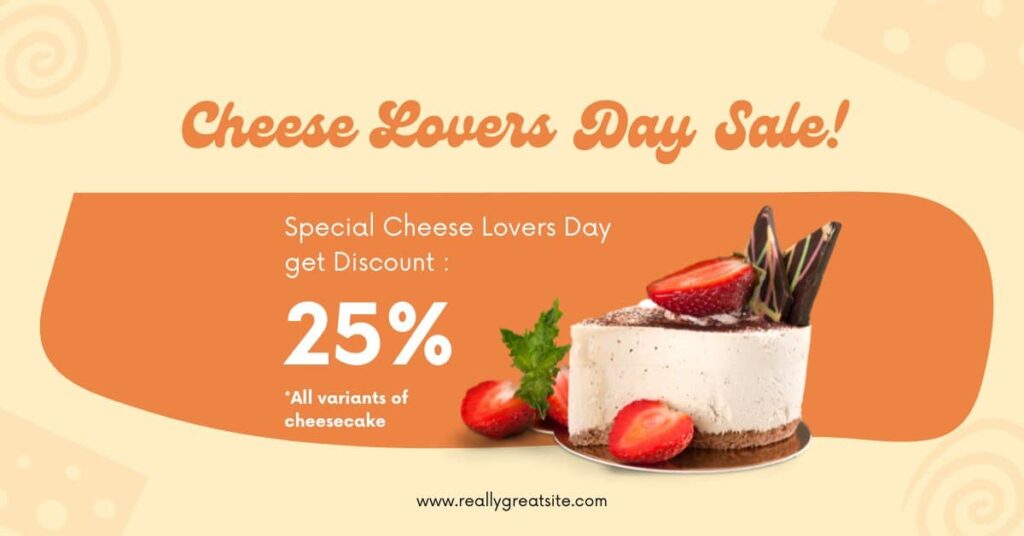
Orange
It does not convey urgency, but is ideal for designing target action buttons. Such elements look positive and friendly, invite the user to subscribe to the newsletter, register or order a product. Orange looks bright and contrasting against the background of any shade.
The visual sets the user to positive and friendliness, focuses on youth and constant movement. It is used for advertising purposes less frequently than all the others. It is suitable for entertainment industry and mass production products. Color can be seen in advertisements for household appliances, drinks, toys, fruits.
Influence in marketing:
- practically not used by elite brands;
- well perceived by children, therefore suitable for promoting children’s goods and educational services;
- looks good on a dark background, can be used as a color element in a banner, for example, a plate for text.
Brands that use orange as their main color: Amazon, Aliexpress, Payoneer, Fanta, Mastercard, Harley Davidson.
Yellow
Under the influence of this color, there is a desire to be creative, a feeling of warmth and happiness.
Yellow is the color of sunshine and joy. But at the same time, it can cause a feeling of fear and frustration.
It attracts attention, but it can also warn of something. It is often used to attract impulsive buyers who are guided by emotions before buying.
Suitable for signs, CTA buttons, pointers, discounts. Used in advertisements for fast food, taxis, youth clothing, food products, money transfers, leisure products.
Use of yellow in creatives:
- such logos are well remembered;
- inspires optimism;
- well attracts attention in combination with black.
Brands that use yellow as their main color: Snapchat, McDonald’s, Nikon, Lipton, Burger King, Chupa Chups, Uber, Renault.

Green
The color of harmony and tranquility, environmental friendliness and freshness. He calls for a purchase. Like a traffic light, it allows the user to make a lead.
Green actively encourages action, therefore it is suitable for almost all offers. It is used in the promotion of everything related to nature, eco products and healthy lifestyles. It is also often used to design CTA buttons.
It can be found in advertisements for food products, for example, tea and cottage cheese, in advertisements for beer, household chemicals, technology, cosmetics, pharmaceutical products, eco products or projects related to ecology.
Green color features:
- associated with development, growth, health and money;
- relaxes the eyes;
- grabs attention and works like a call to action.
Brands that use green as their main color: Animal Planet, Starbucks, Lacoste, Xbox, Spotify, Heineken, Android.

Conclusion
The use of certain colors for different offers effectively affects conversions. Some shades convey a sense of urgency, inspire and motivate, while others muffle excitement and convey a sense of calm.
It happens that changing the visual of one color to the exact opposite increases conversions by several times. Be sure to test different options, track the reaction and get conversions!
Phoenix Native has extensive experience working with advertisers. Our experts work with creatives every day and also advise you to pay attention to the color scheme and its emotional connection with the brand. Of course, the right choice of communication channel, the message that you want to convey to your audience are important components of success. Visual is something that attracts the user’s attention and causes certain sensations in him.
Please note that a lot depends on your business, product and target audience. Therefore, before deciding on the choice of colors, always ask yourself the question:
What problem does the product solve and what emotions should the customer experience?