Each owner of a web resource is important for the effectiveness of the site and a high level of conversions. How to increase monetization and interest users?
Phoenix Native presents a case to your attention. We conducted an experiment that lasted from July 9 to 30, and are ready to share our results.
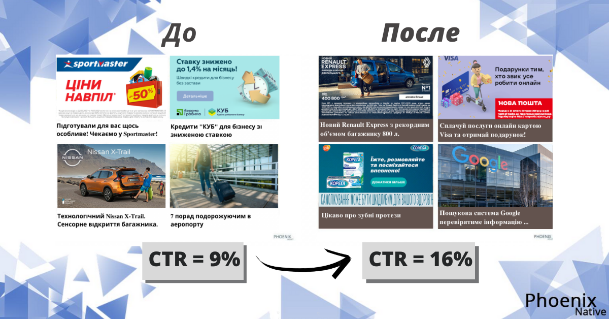
- Initial data. Placement of the widget on the site: https://womfire.com.ua/. The average CTR was 9%.
- What was our task?
Increase CTR.
Make the widget visually attract the attention of site visitors.
Help the site to keep the attention of readers and increase their level of interest.
- Tools. For the experiment, we worked on the design of the widget. The decision was made to change the boring standard look: white background and black text. It was important to present yourself as a user and ensure that it was visually pleasing for him to browse the site. Then different fonts and sizes, text color and backgrounds were selected – there is no way without creativity. Also, it was important for us to coolly combine the widget with the design and layout of the site. Therefore, the final version looked as harmonious as possible.
- Duration of the experiment: 3 weeks.
- Results. The average CTR increased to 16%.

What conclusions did we draw?
Changing the appearance of the widget contributed to a good response from readers. They clearly liked the new bright design. CTR increased by 7%.
Therefore, when creating widget designs, you need to look at everything through the eyes of the user and remember about his requests. It is important to test different tools and study people’s reactions and perceptions.
Phoenix Native does not stop there. Our experts continue to test different functions. In the future, we will be happy to continue to share new discoveries with you.


